Colour

On this page...
Keypoints

AM colour palettes are core, neutral and secondary
This ensures the AM Core Masterbrand will remain impactful whilst allowing the opportunity of flexibility.
Usage of colour palettes is based on the AM brand architecture
Core and neutral colours are the preferred palettes. The Secondary palette is an additional palette for promotional use only. When choosing the correct palette, you need to understand our brand architecture.
The message is priority
Use of the secondary palette allows a myriad of combinations. However colour should not detract from the message. Refer to Combining Colours
How to use the AM colour palettes
The AM colour palette system is designed to maintain brand integrity whilst allowing for flexibility.
Colour palette application is based on the AM brand architecture (see image below).
A general rule of thumb is to consider the message of the application:
- If the communication is from the AM as an organisation only the core and neutral palette should be used eg. internal signage, media release and visitor information.
- If the communication is to promote a specific exhibition, program or event the secondary palette can be used instead of, or in addition to the core and neutral palette.

Core Palette
The core colour palette is the preferred palette to be used for communications from the AM. They can be used with the neutral palette or the secondary palette.

AM Core colour palette
Image: AM Design Studio© AM Design Studio


Neutral Palette
The neutral palette can be used to help unify and complement colours from the core and secondary palettes.

AM Neutral colour palette
Image: AM Design Studio© AM Design Studio


© AM Design Studio
Secondary Palette
The secondary palette can be used for applications that require more flexibility.
The use of the secondary palette allows a myriad of combinations, each creating their own look and feel.

© AM Design Studio


Inspiration for Cockatoo Yellow
Image: AM Design© AM Design

Inspiration for Eucalyptus Green
Image: AM Design© AM Design

Inspiration for Saltwater Aqua
Image: AM Design© AM Design
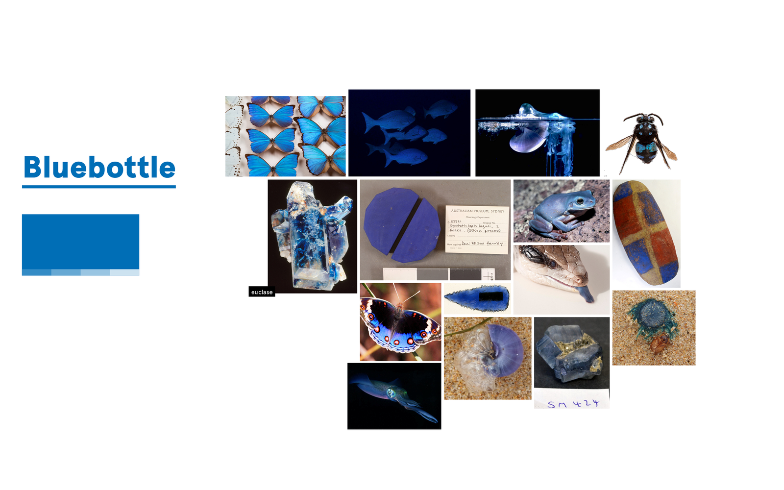
Inspiration for Bluebottle Blue
Image: AM Design© AM Design

Inspiration for Amethyst Purple
Image: AM Design© AM Design
Combining Colours
Considerations when combining colours:
- Number of colours — only two to three colours should be used
- Tone — is the messaging exciting or serious? Colour will play a role in communicating an emotional reaction.
- Contrast vs Monotone — consider whether the messaging requires visual impact or a softer approach.
- Legibility — is the application of colour affecting the legibility of the design? Ensure there is enough tonal contrast to avoid jarring colours and consider using tints.
Below are some examples of how colours can be combined.
Bright and energetic

Bright and energetic
Image: AM Design Studio© AM Design Studio
Warm and earthy

Warm and earthy
Image: AM Design Studio© AM Design Studio
Calm and sophisticated

Calm and sophisticated
Image: AM Design Studio© AM Design Studio
